Insight East Education

- Project Overview -
The Brief
Insight East Education is a local tutoring centre in Rose Bay that provides several tutoring services for Year 2 to Year 12.
The goals were to improve the website's user experience on desktop and mobile platforms and increase the form submission rate. In this project, I used a lean approach to meet the client's goals and budget.
Role
UX & UI Designer
Tools
Keynote, Sketch, Wix (Platform)
Deliverables
User Interviews, Competitive Analysis, Content Hierarchy, Wireframing, Style Guide, UI Design
Why Redesign?
I conducted stakeholder interviews to find out what problems they faced and what their business goals were. For example, they thought the style of their website was a bit outdated and not mobile friendly and wanted to improve their sales.

The goals of this website redesign project
Research & Website Analysis
I researched to understand the demographic of potential users in Rose Bay. I also conducted two user interviews to further understand the educational system in NSW and the tutoring industry. Then, I conducted a web audit to identify usability issues of the original website.

The original website
Problems
-
Unnecessary photo gallery on the first section of the website that caused a long loading time
-
Poor contrast ratio in the [About] section
-
No call-to-action buttons -> Poor user engagement
-
Not mobile-friendly -> Poor accessibility
-
Long [Contact Us] form with many fields -> Decrease users' motivation to fill the form
My Process
Competitive Analysis to explore features
I compared features across the website of other tutoring competitors. I found that every competitor's standard features were 'Contact Us Form', 'Testimonial', 'About', 'Services', and 'Why Choose Us'.

The table of competitive analysis, features by competitor
Content Hierarchy for the website structure
Due to the scope and time constraints, I selected the most important features based on my competitive analysis.
I restructured the website based on what users would expect to see and convince them to use our services.
I also added two call-to-action buttons on the menu navigation to encourage users to make an enquiry either by phone or by filling out a form. The aim of this was to increase the conversion rate.
I decided to create a one-page structure for two reasons:
-
Easy to browse - More people are using mobile devices to check on websites and a one-page website is friendly to mobile users.
-
Easy to maintain - An informative and simple website is more suitable than multiple web pages with a tight budget.

The website structure and how users feel when seeing each section

Menu navigation
Wireframing & Iterations for solutions
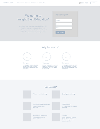
A low-fidelity wireframe is a quick way to align with the clients on how the website will look, its hierarchy and features, and rapidly iterate on the design.


Form Redesign to increase submission rates
Based on my research, having fewer text fields to fill would motivate more users to complete the form. Therefore, I broke up the huge form into two steps so that users will not feel too overwhelmed. I also modified the wording of the first button to 'Get Started' so that it sounded less like a commitment. This meant that users would be more willing to get in contact.

The original form
Step 1

Step 2

The new 2-step form


